

Inspiration
You want to make a social impact, and donate funds to a school can be a way to go. Can you check how these resources are used? Would you donate more if you can learn it?
How it works
Listening to the advices of Lutz Finger this Friday Nov 14th at BIDS, UC Berkeley, we got motivated to create codes that go about answering the data science triplet: ask, measure, learn. By asking the right questions, we unveiled information buried in millions of records from donorschoose.org, and organized them using powerful R analytics and visualization.
Challenges I ran into
Is the graphical representation too cluttered or the question being asked too fuzzy? This was one the main challenges in constructing outputs that would be meaningful in a 2D graphical output and valuable for current and future donors.
Accomplishments that I'm proud of
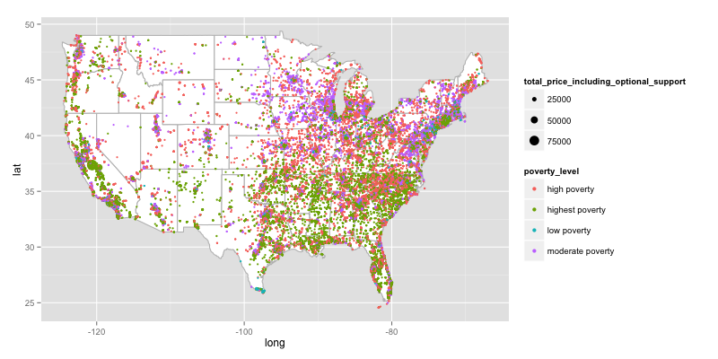
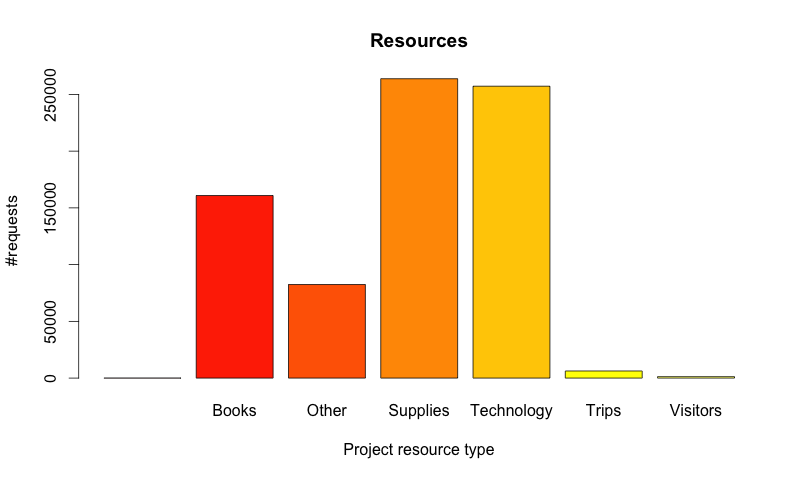
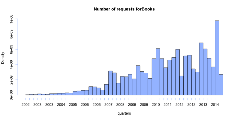
There are three parts of this project that make me proud: Graphs are concise, labeled and with legends, going right to the point Maps give an overall idea of how donorschoose is currently spread across the country Suggestions on which fields should be enforced to be filled (e.g. students reached)
What I learned
Being a donor myself, building these tools, and seeing the statistical analysis made me more confident to donate, to recommend the website to others and even buy gift cards from donorschoose to make our 2014 Christmas more hopeful, particularly for those that are thirsty for knowledge - underserved school communities.
What's next for Donorschoose-donorscheck
Exercising the triplet: "ask, measure, learn" in donorschoose datasets has just begun. Much more can be drawn from this repository such as spread of the requests in time, correlation between type of resource and poverty level, etc.
Built With
- ggmap
- ggplot2
- lubridate
- maps
- r


Log in or sign up for Devpost to join the conversation.