Inspiration:
We think this is a way to make data sets more visual and useful in specific circumstances. The inspiration for the app came from one of Gordon's ideas.
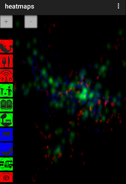
How it works
Depending on which service (or services) is selected, the app will produce a heat map following a color scheme. The more services in an area, the more "heat".
Challenges I ran into
We decided not to implement our former idea. That meant that we had to start over the day of the competition.
Accomplishments that I'm proud of
Communication between the different "departments" was good (e.g. it was easy to ask for specific graphic features needed in the app).
What I learned
Time constraints don't allow for overambitious projects. The choice of the right tools and right members is fundamental.
What's next for What's hot
Implement online and offline maps, implement a "hamburger" menu with icons and title, integrate more data sets from other cities, more user friendly UI. Many other features could be added to this app.
Type
Android App
Built With
- adobe-aftereffect
- adobe-illustrator
- android-studio
- eclipse
- photoshop


Log in or sign up for Devpost to join the conversation.