Inspiration
According to IPCC, the sea level is likely to rise in more 95% of the ocean. We are also expected to experience increased frequencies of droughts and flooding. This poses a problem for both off-shore aquaculture and inland aquaculture as storm surges increase with sea level rise and flooding disrupts aquaculture ponds and the risk of fish escapes. Unfortunately, when planning out their aquaculture pond, fishermen have very little knowledge on the impact that sea level rise and flooding could have. Understanding the impact of increased precipitation and sea level rise in their particular location would help them to be more deliberate in site selection and plan for longer-term economic and environmental sustainability for their aquaculture.
How it works
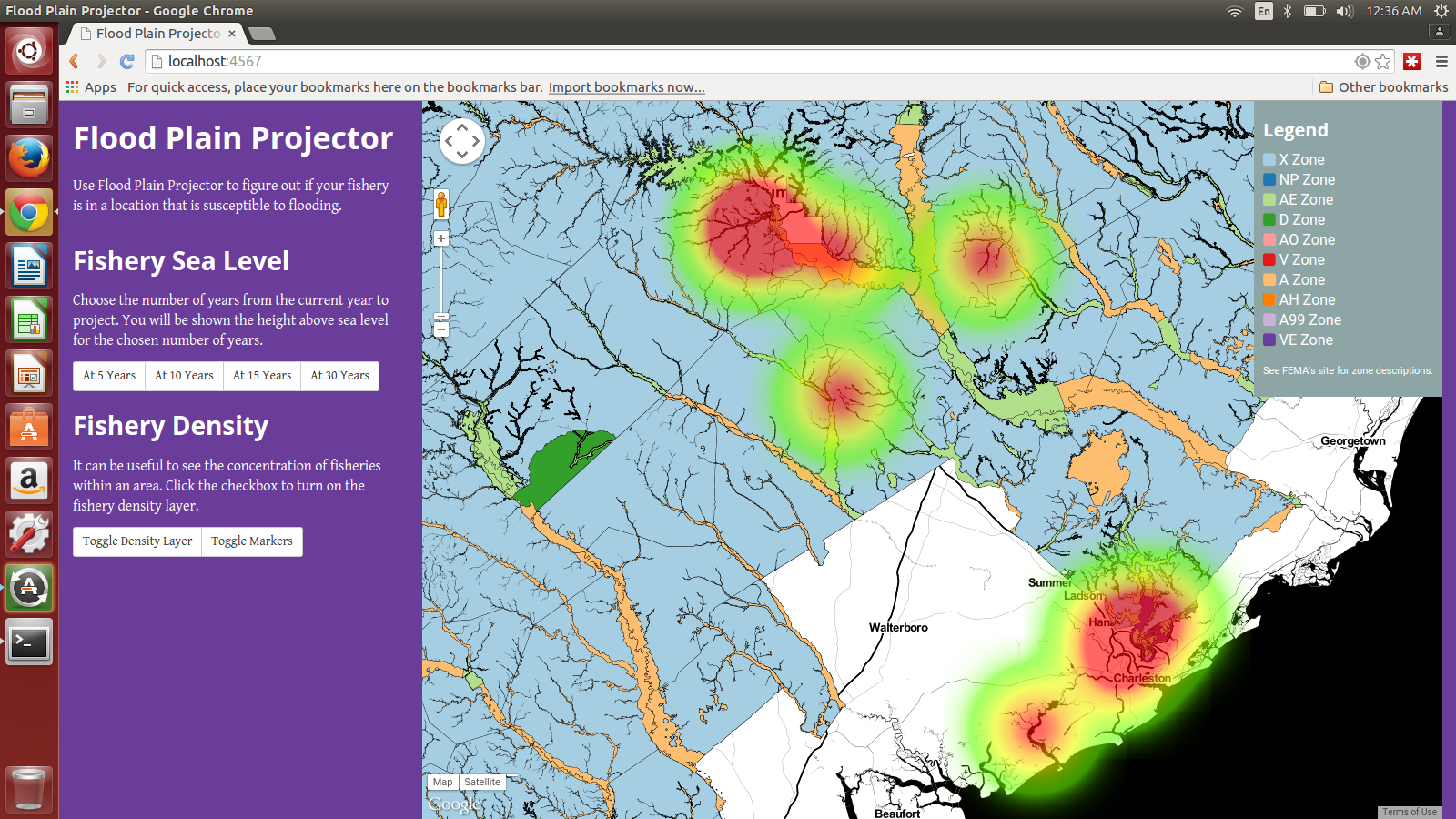
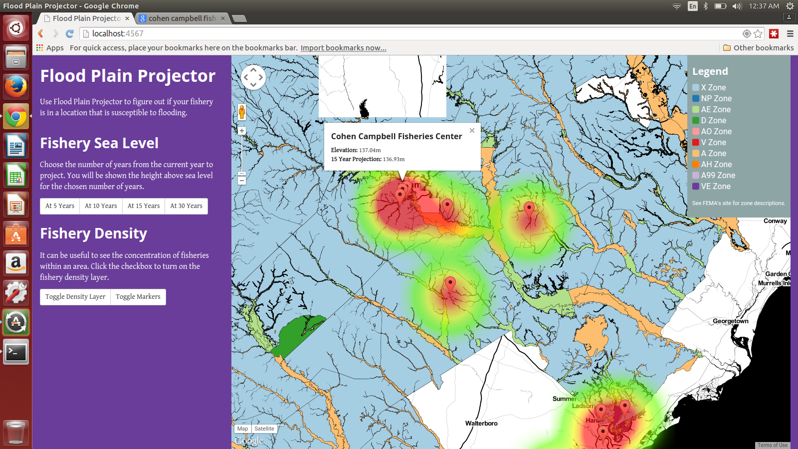
When you access the application, your location is detected and pulls in local fisheries in your area.
If you click a marker, you will see its name, current elevation, and projected elevation for either 5, 10, 15, or 30 years depending on which selection you make in the sidebar. Use the legend and the map to determine what area of flood risk a fishery is in. The only flood zone data we have is for the United States. If you are outside of the United States, you will not see the flood zone overlay.
The projected elevation is derived from a sea rise projection model from NOAA, which was found while reading this technical report: http://scenarios.globalchange.gov/sites/default/files/NOAA_SLR_r3_0.pdf
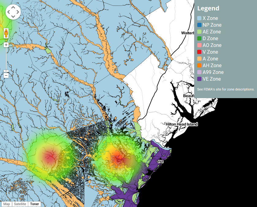
The flood map overlay is generated from FEMA NFHL data collected for the entire United States. This dataset is large, roughly 25GB. The FEMA NFHL datasets were consumed from FEMA via a custom script developed by the team that loads the data into PostGIS for querying. The flood map overlay's tiles were designed by the team using TileMill and are hosted on a tile server setup by the team running TileStache. TileStache generates the tiles via Mapnik using a custom style also designed by the team.
The density map, which can be used as another tool to visualize clusters of fisheries, are using the heatmap library provided by Google Maps.
Challenges We ran into
Finding a model to project sea level rise proved to be challenging. We dug through a lot of papers and technical reports. Fortunately, we found a model that we were satisfied with in the paper mentioned previously: http://scenarios.globalchange.gov/sites/default/files/NOAA_SLR_r3_0.pdf
The FEMA site where their data is available to the public was down during the weekend of the hackathon as well as during the first attempt to ingest the NFHL data after the hackathon.
Dealing with the size of the NFHL dataset was also a challenge, but was dealt with by optimizing PostGIS queries and the Mapnik configuration for generating the tiles.
Accomplishments that We're proud of
We overcame all of the challenges that were in our way of making the prototype that we wanted.
What We learned
Projecting sea level rise is very difficult.
What's next for Flood Plain Projector
Get more flood zone data, optimize the data we already have for fast querying, and add reporting.
Built With
- bootstrap
- google-maps
- gunicorn
- html
- javascript
- mapnik
- middleman
- nginx
- postgis
- ruby
- sass
- tilemill
- tilestache


Log in or sign up for Devpost to join the conversation.