Here's a little bit about us: we're big data lovers, we believe it's time that governments start working for the people and we're pretty big on immersive human experiences. So when we saw the OpenGov API and the Oculus Rift, it was pretty obvious what we would make.
What we've done is built a glimpse into the future of big data and virtual reality.
In 2010 Google CEO Eric Schmidt said "There was 5 exabytes of information created between the dawn of civilization through 2003, but that much information is now created every 2 days, and the pace is increasing." We will need new, innovative ways for the human being to visualize and make sense of such immense data, Data Explorer is definitely one of those tools.
Our target user is anybody who wants to visualize and make sense of their data differently. It may be their company's data, their physics lab data and in our specific instance, government data. Data Explorer allows users to achieve exactly that goal in an intuitive and futuristic way.
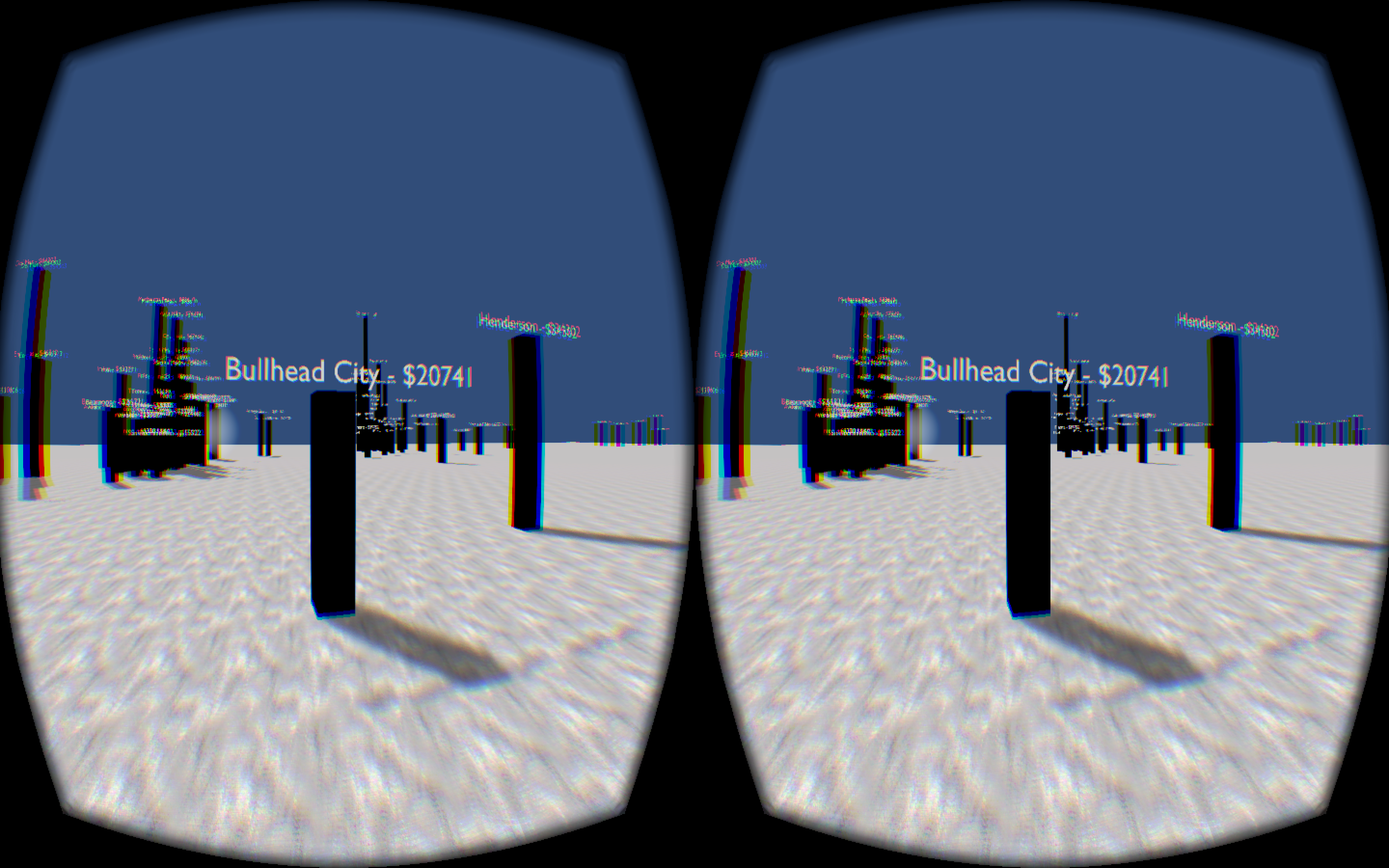
In the version we built, we pulled financial information from over 150 different cities in the United States, along with those cities' latitudes and longitudes from the OpenGov API, and generated a virtual 3D environment from that information for the user to explore. In the example we built, each city is represented by a tower whose height corresponds to that city's income per capita. One of the features we're very proud of is that the distance between each city is proportional to their real world distances, so that as the user navigates the environment, they are navigating a scaled-down version of the real United States. The user starts in the center of the country and can move north, south, east, and west to the city of their choice and visualize the income per capita.
Wait, so why is the tagline: Feel your Data. Walking around data make it very personal and open itself up to new insights and epiphanies. In the example environment that we created, these insights will be related to the relative income of neighboring cities. We are hoping that these visualizations will spark new questions like, "Why is the income so varying in this geographically small area?" or "Why is there such a large income disparity in America? "
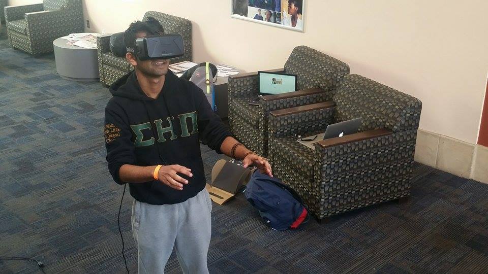
With Data Explorer, you can almost feel your data around you in this surreal experience. Words cannot describe this sensation. You simply have to try it.


Log in or sign up for Devpost to join the conversation.